Saturday, July 23, 2011

KWHSS: Heraldic Regions of Europe and RfS VIII 6b

The hiatus is still in effect, but I've gotten quite a lot done in the past few days and was in the mood to write, so have an unexpected post.

Another talk I went to at KWHSS was on the Heraldic Regions of Europe. If your persona is not Anglo-Norman and you would like your armory to reflect that, there are certain cultural nuances you should learn about and take into consideration.

Heraldic armory, in the sense that typically comes to mind, started in Western Europe and spread eastward (Other types originated elsewhere [such as the mons of Japan], but bear more resemblance to European heraldry in intent than in design.). Like any other style of anything, the farther you get from the source, the less resemblance it bears to the original, and the more local flavor gets thrown in. This means, for example, that some things which are rare in England are common in Germany.  It also means that some things which would not be allowed in England or France are allowed, and often quite common, elsewhere. SCA heraldry does have a rule to allow such regional style. It's in the Rules for Submission, VII 6b:

"6. Documented Exceptions. - An armorial design element that is adequately documented as a period practice may be deemed acceptable even if it violates other sections of Part VIII (Compatible Armorial Style).
Such design elements will be accepted only on a case-by-case basis and only in armory comparable in style and complexity to the documented period examples. The strength of the case for such an exception increases in proportion to: the similarity of the documented examples to the submitted armory; and the number of independent period examples offered as evidence.
a. General Exceptions - In most cases the documentation for a proposed exceptional armorial design element should be drawn from several European heraldic jurisdictions.
The strength of the case for such an exception increases in proportion to the geographical and chronological breadth of the supporting period evidence.
b. Regional Style - Alternatively, a proposed exceptional armorial design element may be documented as characteristic of a specific regional armorial style.
 In such cases the submitted armory may be registered provided that all of the following conditions are met. (1) The submitter explicitly requests an exception to the other sections of Part VIII (Compatible Armorial Style) on the grounds that the submitted armory exemplifies a specific regional style. (2) Documentation is adduced to show that exceptional design element was not uncommon in the regional style in question. (3) Documentation is adduced to show that all elements of the submitted armory can be found in the regional style in question."

In other words, state your case, prove your assertion, and go all-out (no half-English/half-Polish armory). I'll discuss this rule more in my promised Sarmatian-related post. For now, let's go back to the heraldic regions of Europe.


The speaker used Christopher von Warnstedt as his main source. There are four main provinces of European Heraldry, with a fifth category made up of all the border provinces which, in period, mixed regional styles:
I) French-British
II) German-Nordic
III) Latin
IV) East European
V) Border Districts
These are very broad areas and regional differences are going to be present in each (such as Catalan vs. Italian in the Latin Province), but it's a good starting point for someone researching their persona's heraldry.

Some differences are on the way armory works within and between family members. This is uncommon in the SCA, so focus purely on design elements unless you're specifically registering armory similar to a family member (you will likely need permission to conflict).

French-British
 Includes: North and Central France and the British Isles
  • Patterns and semys frequent
  • Furs common
  • Change of arms is common
  • Change of crests is rare
  • Marks of cadency between family members usual
  • Change of tincture common
German Nordic
 Includes: Germany, Scandinavia, Finland, Baltic states, North and Central Switzerland
  •  Furs extremely rare
  • Quartering rare until 15th century
  • Human figures, lions, and eagles all common
  • Unusal "monsters" created and used in armory
  • [Germany] Very different sense of contrast (or lack thereof...); some colors on top of other colors (ex: sable eagle, azure field)
  • Change of arms very rare
  • Mark of cadency usually a change in crest
  • Cadency marks on shield usually absent
  • Change of tinctures very rare
Latin
 Includes: Iberian Peninsula, Southern France, Italy
  • Patterns and semys common
  • (Spain) Labels often couped, ordinaries sometimes combined into one (faja-palo, jefe-chevron,etc...)
  • Change of arms common
  • Change of crests rare
  • Cadency marks on shield usual within families
  • Change of tinctures common
  • Shield shape different from other regions

East European
 Includes: Croatia, Hungary, Poland,Lithuania, Romania, Russia
  • Tamgas and tamga-derived shapes common
  • Negative charges
  • Argent on gules and argent on azure dominant
  • Quartering almost unknown
  • Field divisions, ordinaries, and subordinaries rare
  • (Hungary) Azure field with a charge on a vert trimount common
  • Heraldic clan system
  • Inescutcheons with paternal arms common
  • Marks of cadency almost unknown
Border Districts
 Includes: Netherlands, Belgium, Luxembourg, Alsace-Lorraine, Rhineland, Southern Switzerland and Austria, Czech Republic, West and East Prussia, Silesia, Hinter Pomerania
  • Study your province's history and location- Who has ruled it in the past? What regions are next to it?

von Warnstedt, Christopher, 1970, "The Heraldic Provinces of Europe", The Coat of Arms XI (84): pp.129-30.

Wednesday, July 20, 2011

Hiatus

Between getting married, moving, planning fall recruitment, and wrapping up some paleo research, my life is about to get very busy. I'm taking a small hiatus from blogging and will return no later than mid-September. It will probably be earlier, but I would rather overestimate than underestimate.

Sunday, July 17, 2011

Armory in the SCA

I've been working on something Sarmatian-y to break up the slew of KWHSS posts, but their's a lot of information I should discuss before I actually get to it which is not directly related to Sarmatians. Consider this post 1 of 2 leading up to it.
I realized that I've been discussing devices and badges without actually explaining what or why they are, which might be confusing to someone not familiar with the topic. Devices and badges are collectively called "armoury".
In the SCA, you don't actually get to call your device "arms" until you've been given an award of arms level award. This piece of armoury is what you likely envision when you think of designs on shields and banners. When registered in the SCA, your arms are designed in a shield shape like this:
You don't need to register a device to use it in the SCA, but doing so ensures that no one can register a device similar enough to yours that the two could be confused from 10-20 feet away. Another benefit of registering is that if you yourself are not a herald, you'll have the collective opinions of the SCA College of Arms weighing in on your device to see if it conforms to period style.
There is a caveat to that last statement- Just because a design is registrable via SCA rules does not mean it's good period style (and you might come up with good period style on your own without registering). You'll likely have some heralds commenting that doing such-and-such to it would make it more period, but you won't be rejected purely for that reason. The SCA is its own heraldic jurisdiction. Our rules, though based on what our group has gleaned from period rolls of arms, do give some leeway for avenues of design which those in period might not have used simply because it wasn't aesthetically pleasing to them. (See this post for more details.)
Aesthetics change over time and the SCA Heraldry Rules for Submission allow for this creative modification of a very medieval thing (one reason for the "creative" in Society for Creative Anachronism). Some are more diehard and want very typically period armoury, but if you compare a period roll of arms and an SCA roll of arms, you'll notice that common themes are very different between the two. Especially since our understanding of period style has changed over the years. You'll see some things that used to be allowed which no longer are and sometimes vice-versa.

Period style or not aside, devices/arms in the SCA serve the same purpose as those in period- they mean "This is me." Now, depending on what stretch of period time you're talking about "me" might actually mean "me", or it could also mean "my family", "my province", or "my kingdom".
The original purpose of arms was to identify friend vs. foe on the field of battle. Identification is much quicker that way than taking to the time to assess his armor- especially given that the styles could be similar. Family members might have similar devices only barely different by something called a "cadency step" (like changing the color, adding a charge, etc...). Later on, specific arms were shared by entire families, which is more common today (try looking up your family crest, mon, or other related symbols based on paternal ethnicity). Royal arms became symbols of kingdoms.

Badges serve a similar purpose but often have a slightly different nuance- "This is mine." Much like maker's marks, branding on animals, or the initials your mother may have written on the tags of your clothing, it indicates that something belongs to you. In the SCA, badges are also used as a sort of "clan device". Households in the SCA are groups of people who share a common interest, common location, etc... As non-person entities not recognized as official SCA groups (like shires or baronies), they cannot register devices. They can, however, register badges, which are just like devices except they're registered on a square instead of a shield and can have a tinctureless field (background). That tinctureless field means you can put just the ordinary(ies) on an object without needing the entire thing to be a square shape. Badges also tend to be much simpler than most SCA devices/arms.
People often register badges which are similar to their devices. Ex: John Doe's device might have a gules (red) field with an Or (yellow) lion's head erased (like it was ripped off) within a bordure (border) which is also Or. His badge might be just the Or lion's head erased. He displays his device on his shield and on a banner by his pavilion at camp and his badge as a small detail on his possessions.
They could also be something completely different to delineate between "this is me" and "this is what I do". Ex: Jane Doe's device has an azure (blue field with an argent (white) bend (very thick diagonal line) between two peacocks also in argent because she likes peacocks and thinks bends look cool. She might be a blacksmith, so her badge, which she could put on everything she smiths, might be an azure anvil. If someone buys a helmet they're fond of and that anvil is indented into it, they could look through the SCA armorial (or ask around) to find out who made it so they could commission a breastplate from her.

The Sarmatians had their own brand of heraldry which looked nothing like the Western type we're familiar with, but to discuss that, I should first delve into regional styles of heraldry.

Sunday, July 10, 2011

KWHSS: Italian White Vine Illumination


The illumination class I attended was on bianchi girari, a short-lived humanist style from the 15th century. Humanists thought everything they needed to know about morality and productivity could be found in Greek and Latin classics. They created White Vine illumination as a revival of Carolingian styles from the 8th-12th centuries. It was used in books, but unlike, say, the Book of Kells, you wouldn't see illumination on every page. The title page would have a big border. Sometimes the beginnings of chapters would have borders as well. The first letters of important sections would also be illuminated

It was used all over Italy, but the styles particular to Florence and Naples were the most well-known. Florence white vines were organic-looking and the repetition of sections of vine was not uniform. Naples vines were symmetric and densely-packed. We went through some pictures and made guesses as to which was which, but I had trouble teasing it out as the hard-and-fast rules were not actually hard-and-fast. The density was easier to see than the symmetry or asymmetry. A lot of the asymmetry wasn't really visible until she pointed it out. Probably because the style is so busy and we weren't placing our axes of symmetry in the right place. The pictures on the pdf she made aren't labelled by city and my quick internet search for examples of each has been fruitless, so I don't have exemplars for you.

The hand used in the calligraphy was of the humanist or italic styles. I'm not sure what constitutes an italic hand, but the teacher stressed that it does not equal italicized. The ink for the calligraphy was dark brown rather than black. Black is too harsh and clashes with the flowing, colorful style of bianchi girardi. 


To make your own bianchi girardi, start by tracing existing examples. Do this until you're familiar enough with the style to freehand. They traced in period, so don't feel like you're taking a shortcut.

You will need the following materials:*
  1. Ink
    • Period- Oak gall (can substitute walnut gall if not available)
    • Modern- Substitute any dark brown ink if you're lacking in funds, or worried about toxicity.
  2. Pens and nibs
    • Period-Crow quill nibs work well
    • Modern- Substitute a dark sepia fine point artist's pen if you're new to illumination or lacking in funds. If a pen (other than fountain) is used, you won't need separate ink.
  3. Brushes
    • Fine brushes for detailed painting. Can use toothpicks for the dots.
  4. Colors
    • Gold
      • Period- The bars and bezants were raised gold.
      • Modern- Gold gouache if inexperienced or lacking in funds.
    • Blue
      • Best- Ultramarine
      • Alternative- Slightly dilute dark to medium blues with white.
    • Red
      • Best- Cadmium red
      • Alternative- Madder lake of alizarin crimson
    • Green
      • Sap green
    • Yellow
      • Any opaque yellow. Not a prolific color in period, but can be found occasionally.
    • White
      • Any white which will not let the other colors show through. Vines can be painted white or left the color of the paper.

Sunday, July 3, 2011

KWHSS: Theoretical Calligraphy and Laurel Roadshow

You know how sometimes you take a class- maybe in high school, maybe in college- on a subject that you're only marginally interested in, but the teacher's so phenomenal at teaching and passionate about his subject that it makes you want to learn more? My Intro to Geography teacher in college was like that. So was the Theoretical Calligraphy 101 teacher at KWHSS. If you ever get a chance to take a class with Master Robert Whitcome of Brandywine, leap at the chance.

I enjoy painting pre-prints at SCA events. Pre-prints are only done in some kingdoms. Basically, scribes make scrolls to give out as awards. In some kingdoms, the scrolls are made individually for each awardee- scribes employed for the work do all the work. Having a tailor-made scroll is fantastic- the downside is that Crowns give out a lot of awards, and scribes may find they have too much work to do and end up with a backlog. In kingdoms which do pre-prints, the Award-of-Arms level scrolls- the lowest of the three tiers- are all photocopies of scrolls calligraphied and drawn by scribes hired by the Crown. Members of the populace have the opportunity to paint them at events (adding their own doodles if they so wish). The only thing unique about your scroll is the paintjob, but you can be assured of getting it when you're actually given the award.

I'm being encouraged to pursue the drawing part of illumination, so I figured I should know a little bit about calligraphy as well. Theoretical Calligraphy 101 seemed like the best place to do that- especially given that the teach would be discussing how all Roman alphabets are based on that carved into Trajan's column- a tower with a giant spiral mural depicting scenes from the Dacian War which include Sarmatians fighting in scale mail.
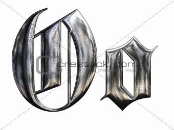
 He wrote (drew?) an 'O' on the board from a hand he based on a Dürer script, then told us to draw it. Something like the lowercase 'o' in this picture, but without the curves and the little blips off to the side.
Almost all of us (I'm willing to bet all of us with no calligraphy experience) immediately drew little hexagons and stared at them in confusion, trying to figure out how ours' ended up looking so different. Then he revealed that it's not a hexagon- it's a parallelogram. "But it has six sides!" we think. But look at the negative space in the middle- it's four-sided. The illusion of a character made from six strokes comes from the elongate shape of the end of a calligrapher's pen- one stroke up-and-down, followed by a short diagonal one beneath. Move back to the top, connect one end of your tip to the side of the up-and-down stroke to make another short diagonal followed by a second up-and-down stroke. There was an audible "Ohhhhh" from all of us. By-the-by- make that negative space the same width as the positive strokes to make it more pleasing to the eye.
He packed so much information into a hour it's insane, some about what our eyes like and are drawn to and some about how to grow as calligraphers.

 After that class, I find myself wanting to take the calligrapher's pens he gave us and spend hour after hour writing letters like a kindergartner again until I have them looking consistently better than when I started. I don't have time right now since I'm busy finishing two papers while in the final stages of wedding planning, but some day!

After Master Robert's class, the room was free, so he offered to teach a 30-minute Gothic class. I thought about staying but decided to spend that last half hour before we had to leave in the Laurel Roadshow. I hadn't been to one before I thought this would be the ideal time to see what it's all about. I wish I had stayed for the 30-minute Gothic... We got through 1 1/2 people's submissions. The one still being argued over when I left was whether a device should be returned for redraw- There were two boar's heads in pale (top and bottom) and two bear's heads in fess (left and right). A very vocal handful of people declared that the bear's heads did not look like bear's heads; rather, they were weasels or cats. Weasels I could understand, sure, if you've stopped to take note of a weasel's face, but cats?  I have no idea how they got cats out of that. Cats have short snouts and bears most definitely do not. People were really laying into how they don't look like bears when the poor woman who had drawn them (surprise! she was there!) spoke up that she'd done the best she could with what she had, and that they were straight out of a[n] (admittedly post-period, but widely used) book. I would have spoken up had I felt like my voice could be heard in that huge ballroom (a vocal herald I am not). Weasels have a much longer post-temporal region than bears (that's the part behind the eyes). To someone knowledgeable about zoology, they could have been nothing but bears. That poor woman really should have been cut some slack...not everyone is an artist. I thought she did well.

Which brings up the one unfortunate thing I saw at this event- heralds who react hostilely to those who don't know what they know. There's a stigma out there that heralds don't want you to do this and don't want you to do that and they won't let you and they're strict and stuffy...It's the occasional herald with behavior like that who perpetuates the stereotype. Our job is to help people find things that work for them using what we understand of period naming and armorial practices- not to scoff at them for not knowing the same factoids we do. It's sad to see people- some in positions of power, no less- who do that. I hope they at least temper themselves around the submitters...no one should be made to feel like an idiot for being ignorant of esoteric knowledge. If you find yourself as a submissions, consultation, or commentary herald, please remember that you were once as ignorant as they. If they want to work with you (there are sometimes difficulties wherein the submitter decides what they want and don't care whether they follow the rules, but those cases are few), do your best to make both theirs and your experience a pleasant one. If you can't act appropriately, then much like in the belly dancing community, which has to fight the very wrong stigma that we're glorified strippers, the rest of us would much rather you move on to another hobby.