Showing posts with label calligraphy. Show all posts

Saturday, March 4, 2017

Of Ph.D.s, scrolls, and cats

The big hurdle that made me stop updating the blog is over. I got my Ph.D. in December. But I'm not over research burnout (I've had it for a few years now...), and there's no immediate need for me to continue making myself miserable pushing it, so it's going to be a good while before I start making regular or in-depth posts here again. And career research is going to take priority over fun research when I'm able to do research again until I have at least one paper accepted. But I've amassed a few books in the meantime that I'm going to scour for topics and information, and also still have travelogues from my trip to Inner Mongolia to post.

I've been making little forays into getting active in the SCA again. I've been to a few events and local group meetings. I've attended a couple kingdom heraldry meetings and occasionally commented on KLOIs on OSCAR. At some point I'd like to take on vacant and will-be-vacant heraldry and A&S officer positions in my barony and canton, but I'm having to be very, very mindful of how much responsibility I shoulder. Now that the dissertation's done, I can actually work on healing from all the burnout, anxiety, and depression it caused. I agreed to be a local officer in my union because it was needed (and this is a bargaining year...), but that meant delaying being an SCA officer again. Which is fine. It will happen. All the self care I'm doing is paying off and I'm much happier than I was in December, though I still have a ways to go before I can operate at near-full capacity again.

I took on a scroll assignment (Caid does all scrolls by request; very different from Calontir's AoAs-as-preprints system). I found a calligraphic hand from the right time and place for the person, taught myself to make it, then made the scroll from start to finish....then my cat stepped on it while the ink was still wet.
Stupid cat...

And it isn't even obvious pawprints, so I can't just shrug and say "it's period!" (even though it is). It just looks like I've smudged it. It's on bristol board so I don't think I can scrape it well (and it turns out I made a typo in the final draft that wasn't in the rough drafts anyway, so bleh). It was frustrating and I was still in the midst of dissertation frustration with some upsetting parallels, so I put it down for a while. When I finally felt like picking it back up...I finished the calligraphy and the cat immediately hopped up on the table and it. *headdesk* But I'm bound and determined to get it done in time for summer coronation. I think I may lock the cat away while I'm working and before the ink dries this time.

Monday, June 4, 2012

Creating a Scroll

This isn't a post about how to design a scroll in a period style, or how to design a scroll for an award- you can find those here, here, and here- it's about how to go from a blank page to a finished piece. The start of a project can be very intimidating. What it should be, though, is invigorating. It's a chance to try something out. If you mess up, that's okay, because you tried and that's better than doing nothing. You can try to fix it or you can start over, up to you.

Here are the steps once you've come up with the concept and a layout:
1) Lightly pencil in blobs that will one day be the locations of your illuminations. Realize that these might change, so plan on fluidity- particularly if your scroll will have multiple modules interacting with one another. (This picture is from my test scroll, hence the different levels of progression in different parts. I forgot to take picture of this stage from the actual scroll.)
2) Are you doing calligraphy? Do your entire calligraphy sequence a couple of times on scrap paper to get an idea of how much space it's going to take up. This should all be done in one sitting because your hand can be slightly different depending on your mood, energy, etc...- especially if you haven't been doing it for years and years. Experiment with width, height, and spacing until you're happy with how it will fit in with the illumination. Pick a hand that works with your illumination style.
3) Pencil in guidelines for the calligraphy and possibly box in the space it needs to be contained in. Now do the calligraphy. This should be done in the same sitting as the practice runs. Always do calligraphy first because it doesn't take anywhere near as long to re-do as illumination does. This means that if something goes wrong which can't be rectified, you waste much less time starting over. Pick the right color for the calligraphy- black is the default, but some styles (like Italian White Vine) call for brown calligraphy.
 4) Now start sketching the actual shapes and details for your illumination. You might think about doing general shapes first, then details if your scroll is very modular (i.e., has multiple parts). Like doing calligraphy first, this is to waste less time re-doing stuff if you change your mind, mess up, or find your style changing as you work.

5) Got everything all penciled in to your liking? Here's where the process becomes less linear. I like to ink my lineart first. My husband suggested I should paint, then ink, but I like having more visible lines to paint between. So this step is optional- ink over your pencil lines then erase them. Doing all one line weight is very simple but also very boring. Do major delineations in a thicker weight (a .08 micron is good), then smaller and smaller details in smaller weights (.05, .03, .02, .01, and .005 microns are all options).
 6) Here's another step that's optional- do your leafwork, be it gold, silver, or something else. This is particularly important if you're using metal leaf because it will stick to gouache, and you don't want you painted portions covered up by gold leaf.I used gouache, so in this case I didn't need to do metalwork first, though I typically do anyways.
7) Once you have your shapes drawn (be they in pencil or pen), lay down the base colors of paint.
8) Now do shading, highlights, and whitework. It might seem like you don't need it at first, but if you try any of the above, you'll probably think your illumination looks much better for it.
9) Draw ink lines over where the pencil was/is (erase pencil if still there). Do this step even if you already did optional step #5 because unless you are an absolutely amazing painter, there will probably be bits and pieces of your lineart covered at least partially by paint. You don't necessarily have to re-ink the entire thing- just fix what needs to be fixed.
Ta-da! You just made an illuminated manuscript from start to finish. That wasn't so bad, was it? :)


About the piece


The Golden Deer of Eurasia: Scythian and Sarmatian Treasures from the Russian Steppes, The Metropolitan Museum of Art, 2000.

Sunday, July 10, 2011

KWHSS: Italian White Vine Illumination


The illumination class I attended was on bianchi girari, a short-lived humanist style from the 15th century. Humanists thought everything they needed to know about morality and productivity could be found in Greek and Latin classics. They created White Vine illumination as a revival of Carolingian styles from the 8th-12th centuries. It was used in books, but unlike, say, the Book of Kells, you wouldn't see illumination on every page. The title page would have a big border. Sometimes the beginnings of chapters would have borders as well. The first letters of important sections would also be illuminated

It was used all over Italy, but the styles particular to Florence and Naples were the most well-known. Florence white vines were organic-looking and the repetition of sections of vine was not uniform. Naples vines were symmetric and densely-packed. We went through some pictures and made guesses as to which was which, but I had trouble teasing it out as the hard-and-fast rules were not actually hard-and-fast. The density was easier to see than the symmetry or asymmetry. A lot of the asymmetry wasn't really visible until she pointed it out. Probably because the style is so busy and we weren't placing our axes of symmetry in the right place. The pictures on the pdf she made aren't labelled by city and my quick internet search for examples of each has been fruitless, so I don't have exemplars for you.

The hand used in the calligraphy was of the humanist or italic styles. I'm not sure what constitutes an italic hand, but the teacher stressed that it does not equal italicized. The ink for the calligraphy was dark brown rather than black. Black is too harsh and clashes with the flowing, colorful style of bianchi girardi. 


To make your own bianchi girardi, start by tracing existing examples. Do this until you're familiar enough with the style to freehand. They traced in period, so don't feel like you're taking a shortcut.

You will need the following materials:*
  1. Ink
    • Period- Oak gall (can substitute walnut gall if not available)
    • Modern- Substitute any dark brown ink if you're lacking in funds, or worried about toxicity.
  2. Pens and nibs
    • Period-Crow quill nibs work well
    • Modern- Substitute a dark sepia fine point artist's pen if you're new to illumination or lacking in funds. If a pen (other than fountain) is used, you won't need separate ink.
  3. Brushes
    • Fine brushes for detailed painting. Can use toothpicks for the dots.
  4. Colors
    • Gold
      • Period- The bars and bezants were raised gold.
      • Modern- Gold gouache if inexperienced or lacking in funds.
    • Blue
      • Best- Ultramarine
      • Alternative- Slightly dilute dark to medium blues with white.
    • Red
      • Best- Cadmium red
      • Alternative- Madder lake of alizarin crimson
    • Green
      • Sap green
    • Yellow
      • Any opaque yellow. Not a prolific color in period, but can be found occasionally.
    • White
      • Any white which will not let the other colors show through. Vines can be painted white or left the color of the paper.

Sunday, July 3, 2011

KWHSS: Theoretical Calligraphy and Laurel Roadshow

You know how sometimes you take a class- maybe in high school, maybe in college- on a subject that you're only marginally interested in, but the teacher's so phenomenal at teaching and passionate about his subject that it makes you want to learn more? My Intro to Geography teacher in college was like that. So was the Theoretical Calligraphy 101 teacher at KWHSS. If you ever get a chance to take a class with Master Robert Whitcome of Brandywine, leap at the chance.

I enjoy painting pre-prints at SCA events. Pre-prints are only done in some kingdoms. Basically, scribes make scrolls to give out as awards. In some kingdoms, the scrolls are made individually for each awardee- scribes employed for the work do all the work. Having a tailor-made scroll is fantastic- the downside is that Crowns give out a lot of awards, and scribes may find they have too much work to do and end up with a backlog. In kingdoms which do pre-prints, the Award-of-Arms level scrolls- the lowest of the three tiers- are all photocopies of scrolls calligraphied and drawn by scribes hired by the Crown. Members of the populace have the opportunity to paint them at events (adding their own doodles if they so wish). The only thing unique about your scroll is the paintjob, but you can be assured of getting it when you're actually given the award.

I'm being encouraged to pursue the drawing part of illumination, so I figured I should know a little bit about calligraphy as well. Theoretical Calligraphy 101 seemed like the best place to do that- especially given that the teach would be discussing how all Roman alphabets are based on that carved into Trajan's column- a tower with a giant spiral mural depicting scenes from the Dacian War which include Sarmatians fighting in scale mail.
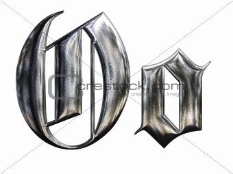
 He wrote (drew?) an 'O' on the board from a hand he based on a Dürer script, then told us to draw it. Something like the lowercase 'o' in this picture, but without the curves and the little blips off to the side.
Almost all of us (I'm willing to bet all of us with no calligraphy experience) immediately drew little hexagons and stared at them in confusion, trying to figure out how ours' ended up looking so different. Then he revealed that it's not a hexagon- it's a parallelogram. "But it has six sides!" we think. But look at the negative space in the middle- it's four-sided. The illusion of a character made from six strokes comes from the elongate shape of the end of a calligrapher's pen- one stroke up-and-down, followed by a short diagonal one beneath. Move back to the top, connect one end of your tip to the side of the up-and-down stroke to make another short diagonal followed by a second up-and-down stroke. There was an audible "Ohhhhh" from all of us. By-the-by- make that negative space the same width as the positive strokes to make it more pleasing to the eye.
He packed so much information into a hour it's insane, some about what our eyes like and are drawn to and some about how to grow as calligraphers.

 After that class, I find myself wanting to take the calligrapher's pens he gave us and spend hour after hour writing letters like a kindergartner again until I have them looking consistently better than when I started. I don't have time right now since I'm busy finishing two papers while in the final stages of wedding planning, but some day!

After Master Robert's class, the room was free, so he offered to teach a 30-minute Gothic class. I thought about staying but decided to spend that last half hour before we had to leave in the Laurel Roadshow. I hadn't been to one before I thought this would be the ideal time to see what it's all about. I wish I had stayed for the 30-minute Gothic... We got through 1 1/2 people's submissions. The one still being argued over when I left was whether a device should be returned for redraw- There were two boar's heads in pale (top and bottom) and two bear's heads in fess (left and right). A very vocal handful of people declared that the bear's heads did not look like bear's heads; rather, they were weasels or cats. Weasels I could understand, sure, if you've stopped to take note of a weasel's face, but cats?  I have no idea how they got cats out of that. Cats have short snouts and bears most definitely do not. People were really laying into how they don't look like bears when the poor woman who had drawn them (surprise! she was there!) spoke up that she'd done the best she could with what she had, and that they were straight out of a[n] (admittedly post-period, but widely used) book. I would have spoken up had I felt like my voice could be heard in that huge ballroom (a vocal herald I am not). Weasels have a much longer post-temporal region than bears (that's the part behind the eyes). To someone knowledgeable about zoology, they could have been nothing but bears. That poor woman really should have been cut some slack...not everyone is an artist. I thought she did well.

Which brings up the one unfortunate thing I saw at this event- heralds who react hostilely to those who don't know what they know. There's a stigma out there that heralds don't want you to do this and don't want you to do that and they won't let you and they're strict and stuffy...It's the occasional herald with behavior like that who perpetuates the stereotype. Our job is to help people find things that work for them using what we understand of period naming and armorial practices- not to scoff at them for not knowing the same factoids we do. It's sad to see people- some in positions of power, no less- who do that. I hope they at least temper themselves around the submitters...no one should be made to feel like an idiot for being ignorant of esoteric knowledge. If you find yourself as a submissions, consultation, or commentary herald, please remember that you were once as ignorant as they. If they want to work with you (there are sometimes difficulties wherein the submitter decides what they want and don't care whether they follow the rules, but those cases are few), do your best to make both theirs and your experience a pleasant one. If you can't act appropriately, then much like in the belly dancing community, which has to fight the very wrong stigma that we're glorified strippers, the rest of us would much rather you move on to another hobby.